
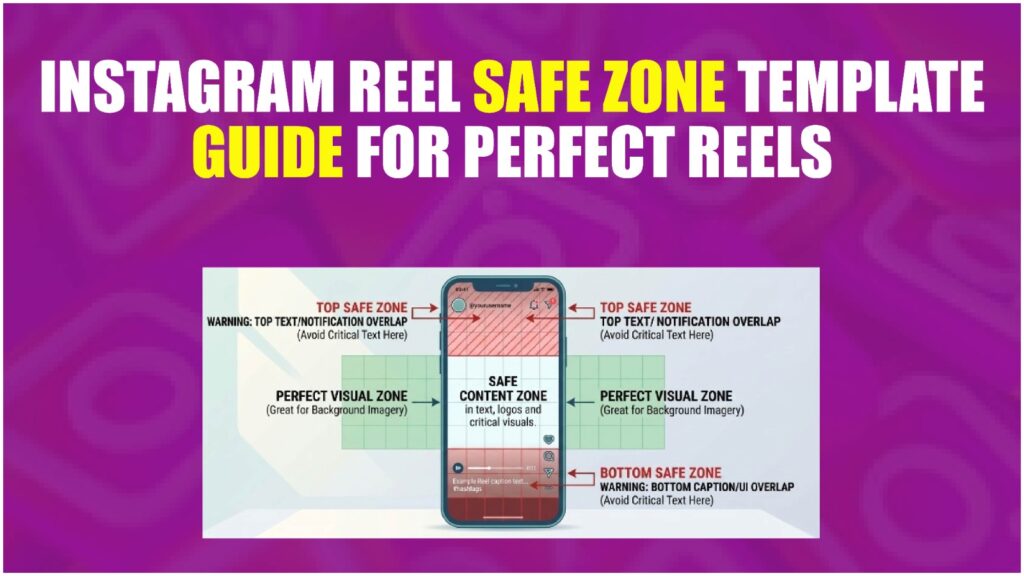
What Is the Instagram Reels Safe Zone — and Why Does It Keep Burning Creators?
The Instagram Reels safe zone is the region of your 1080×1920px canvas where text, logos, and CTAs will actually be visible after Instagram’s UI elements — the progress bar, username tag, caption strip, like/comment/share buttons, and audio label — are layered on top of your video.
Most guides stop there. They don’t tell you the part that actually costs you.
Here’s the thing: Instagram’s UI doesn’t behave the same way across every device. On a smaller Android screen, those button overlays sit noticeably higher than they do on an iPhone 15 Pro Max. This is why a template that “looked fine” on your own phone can still look broken to 40% of your audience.
According to multiple 2025–2026 sources including Meta’s own reported figures, Instagram Reels now reach over 2 billion monthly active users — with Reels accounting for 50% of all time spent on the platform. A misplaced CTA isn’t a minor aesthetic issue. It’s a conversion problem at scale.
Definition Block: An Instagram Reels safe zone template is a layered design file (Figma, Canva, or PSD) that overlays Instagram’s UI elements onto a 1080×1920px canvas, showing designers exactly which pixel regions are obstructed so text and graphics can be placed safely. The usable safe zone sits roughly between 108px from the top and 320px from the bottom of the frame.
The Exact Pixel Breakdown: Every UI Element That Blocks Your Content
This is what most guides skip entirely — the actual numbers.
Instagram’s Reels UI sits in predictable zones, even if the platform never officially publishes them. Based on reverse-engineering from community template files (Figma community, updated Q1 2025) and cross-device testing documented by Jon Loomer, here’s the breakdown:
| UI Element | Position | Height / Width | Safe Clearance Needed |
|---|---|---|---|
| Progress bar (scrubber) | Bottom | ~4px bar + 50px touch zone | 108px top clearance |
| Username + follow button | Bottom-left | ~120px tall zone | 320px bottom clearance |
| Caption strip | Bottom | Expands dynamically | Right: 120px |
| Like / Comment / Share buttons | Right side | ~200px wide, lower 40% | Left: 60px |
| Audio label (song name) | Bottom-left | ~80px tall | Overlaps with username zone |
| Top status bar + story ring | Top | ~100–130px | Keep content below 252px from top |
The universal safe zone, covering the widest range of devices: 108px from top to 320px from bottom, centered, with 108px margin on each side.
Or maybe I should say it this way — if you’re working in percentages rather than pixels: keep everything important inside the center 70% of the frame width, and between 13% and 54% from the top.
That’s it. That one box is your real estate.
How to Use a Reels Safe Zone Template (Step-by-Step)
Knowing the numbers is one thing. Actually applying them in your design tool is where people stall. Here’s how to do it in the three tools creators actually use.
How-To Block:
To apply an Instagram Reels safe zone template to your design:
- Download or duplicate the safe zone overlay file for your tool (Canva, Figma, or Adobe Express).
- Lock the overlay layer so it cannot be accidentally moved or edited.
- Place all text, CTAs, and logos inside the highlighted safe zone boundary.
- Preview the video with the overlay hidden before exporting.
- Export at 1080×1920px, H.264, under 4GB.
In Canva:
Search “Instagram Reels safe zone” in Canva’s template library. Several community-built versions exist with the UI zones pre-marked in semi-transparent overlays. Lock the overlay frame before designing on the layers below it. Quick note: Canva’s built-in Reels templates do NOT include safe zone guides by default — you have to find the community ones specifically.
In Figma:
The Figma Community has published safe zone frames updated for 2024–2025. Search “Instagram Reels safe zone” in the Community tab. Duplicate the frame to your project, lock the UI overlay layer, and design inside the marked boundaries. This is the most precise option if you’re working on brand-level content.
In Adobe Express:
Adobe Express’s 1080×1920 Reels template is clean but has no native safe zone overlay. You’ll need to manually add a rectangle at the safe zone coordinates above and lock it on its own layer.
Look — if you’re designing Reels for a client and they keep asking why the text looks “weird” on their phone, this template approach is what actually fixes it permanently. Not eyeballing. Not trial and error.
Canva vs Figma for Safe Zone Work: Which Should You Use?
Comparison Block:
Canva vs Figma for Reels safe zone templates: Canva is better suited for solo creators and quick turnarounds because templates are pre-built and require no design system knowledge. Figma works better when designing at scale for clients or teams because layers, components, and version control are significantly more precise. The key difference is collaboration depth — Figma wins for brand consistency, Canva wins for speed.
| Option | Best For | Key Benefit | Limitation |
|---|---|---|---|
| Canva (community template) | Solo creators, fast output | No learning curve | Less precise layer control |
| Figma (community frame) | Brand designers, agencies | Pixel-perfect, shareable | Requires Figma familiarity |
| Adobe Express | Adobe Creative Cloud users | Integrates with Premiere | No native safe zone guide |
| Manual overlay (any tool) | Any skill level | Full control | Time-consuming to set up |
The Mistakes Creators Keep Making (Even With a Template)
I’ve seen conflicting data here — some sources say the bottom 30% is the true danger zone, others mark it closer to 40%. My read is that 35% is the practical safe cutoff on most iOS devices, but Android variance pushes that to 40% if you’re designing for a mixed audience.
The most common errors, in order of how often they destroy a post:
Centering text too low
The instinct is to place a CTA near the bottom third — that’s photography composition thinking. On Reels, that zone is owned by Instagram. Your CTA belongs in the middle third, full stop.
Not accounting for caption expansion
When a viewer taps to read a long caption, the expanded text panel covers even more of the lower frame. If your key visual is already near the bottom, it gets buried twice.
Assuming your phone = everyone’s phone
Designing on a notch-heavy device and checking only on that device is how subtle cropping stays invisible until a client calls you about it.
One opinion that might get pushback: the “rule of thirds” framing that most design courses teach actively works against you on Reels. The bottom third — the most visually interesting zone in photography — is almost entirely compromised by UI. Designing for Reels means learning to work with a center-weighted composition bias, not the thirds grid.
Running Ads? Your Safe Zone Just Got Smaller
Organic Reels and paid Reels are not the same thing. This is the distinction almost every safe zone guide ignores — and it’s the one that costs advertisers the most.
When you run a Reels ad through Meta Ads Manager, Instagram layers two additional UI elements that don’t exist in organic Reels: a “Sponsored” label in the top-left corner, and a CTA button at the bottom (“Shop Now,” “Learn More,” “Sign Up”). That CTA bar alone eats roughly 100–120px of additional bottom space.
The practical result: 320px bottom clearance is fine for organic content. For paid ads, treat 400px as your minimum bottom clearance — no exceptions.
| Content Type | Top Clearance | Bottom Clearance | Right Clearance |
|---|---|---|---|
| Organic Reels | 108px | 320px | 120px |
| Meta Reels Ads | 108px | 400px+ | 120px |
If you’re using the same video for both organic posting and paid promotion — always design to the stricter ad spec. A 400px bottom clearance works perfectly for both. Design once, use everywhere.
Cross-Posting to TikTok? The Safe Zones Are Not Identical
A lot of creators upload the same video to Instagram Reels and TikTok simultaneously. Makes sense — same effort, double the reach. The problem is that both platforms place their UI overlays in different positions, so content that’s perfectly safe on one can get cut off on the other.
TikTok’s right-side button cluster sits slightly higher than Instagram’s. TikTok’s caption also expands differently. If you design purely to Instagram’s safe zone and upload that same video to TikTok, the right-side buttons can cover your text or logo — especially if you’ve placed anything near the 120px right margin.
| Platform | Top | Bottom | Left | Right |
|---|---|---|---|---|
| Instagram Reels | 108px | 320px | 60px | 120px |
| TikTok | 100px | 300px | 45px | 150px |
| Safe for Both | 108px | 320px | 60px | 150px |
The “Safe for Both” row is the only one that matters if you cross-post. Follow those numbers exclusively — and push your right-side clearance to 150px to clear TikTok’s button cluster.
Frequently Asked Questions (FAQs)
What’s the safe zone size for Instagram Reels?
The safe zone is approximately 864×828px, centered on the 1080×1920 canvas — starting 108px from the top and ending 320px before the bottom, with 108px clearance on each side.
How do I stop Instagram from cutting off my text in Reels?
Use a safe zone template overlay in Canva or Figma that shows the UI obstruction areas, and keep all text inside the central safe region between 252px and 1038px from the top.
Should I use Canva or Figma for a Reels safe zone template?
Use Canva for speed — it has community templates ready to use. Use Figma for precision if you’re designing at scale for clients or need reusable brand components.
Why does my Instagram Reel look different on different phones?
Instagram’s UI button placement varies slightly by screen size and OS. The safe zone dimensions above are conservative enough to cover most iOS and Android devices, but Android variance can push the danger zone up by 5–10%.
When should I update my Reels safe zone template?
Check your template whenever Instagram rolls out a major UI update — roughly every 6–12 months. The community Figma frames linked above are typically updated within weeks of platform changes.
